
Boise Curling Club
As the club sets its sights on a promising future, they sought a new identity that aligned with their vision.
A Very Boise Identity
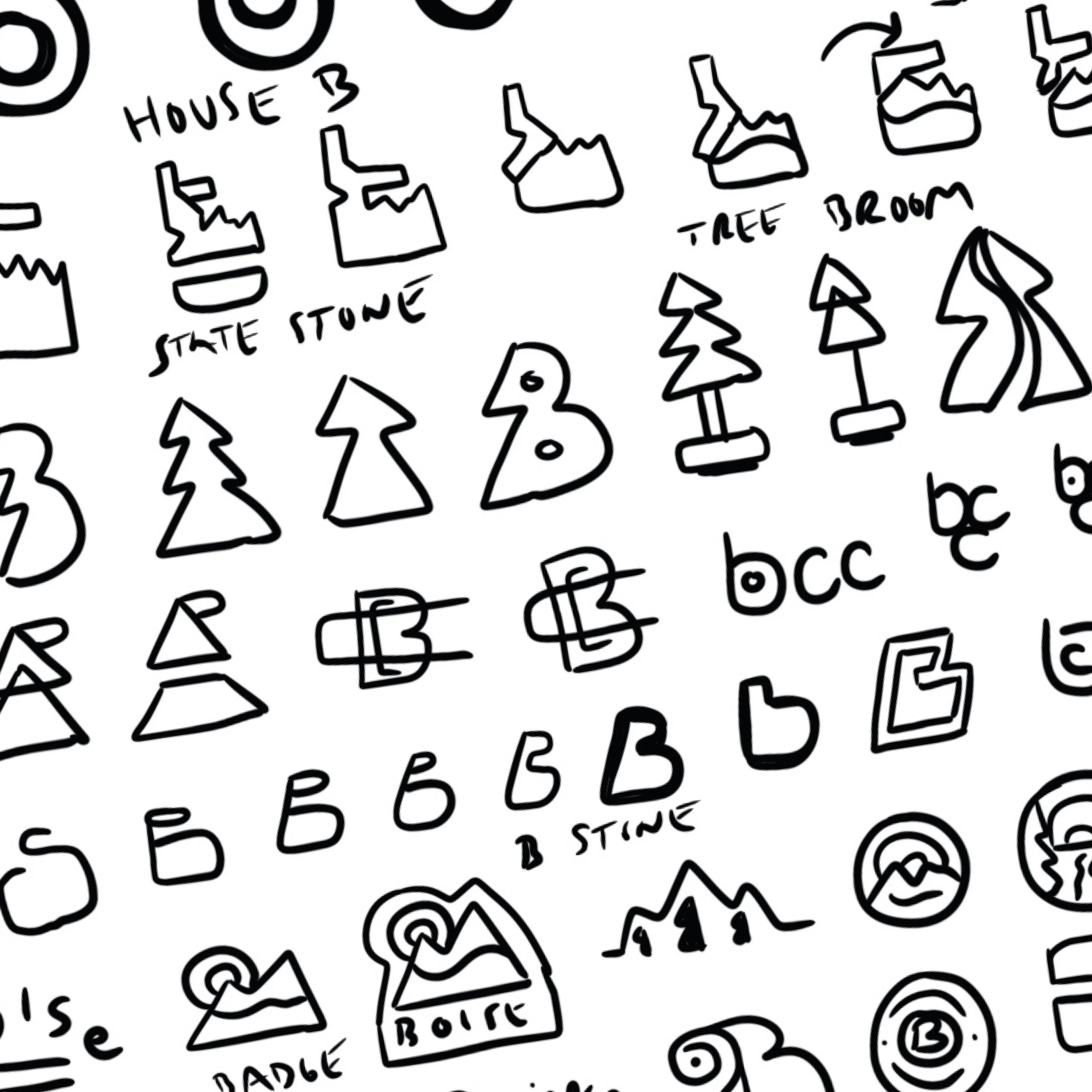
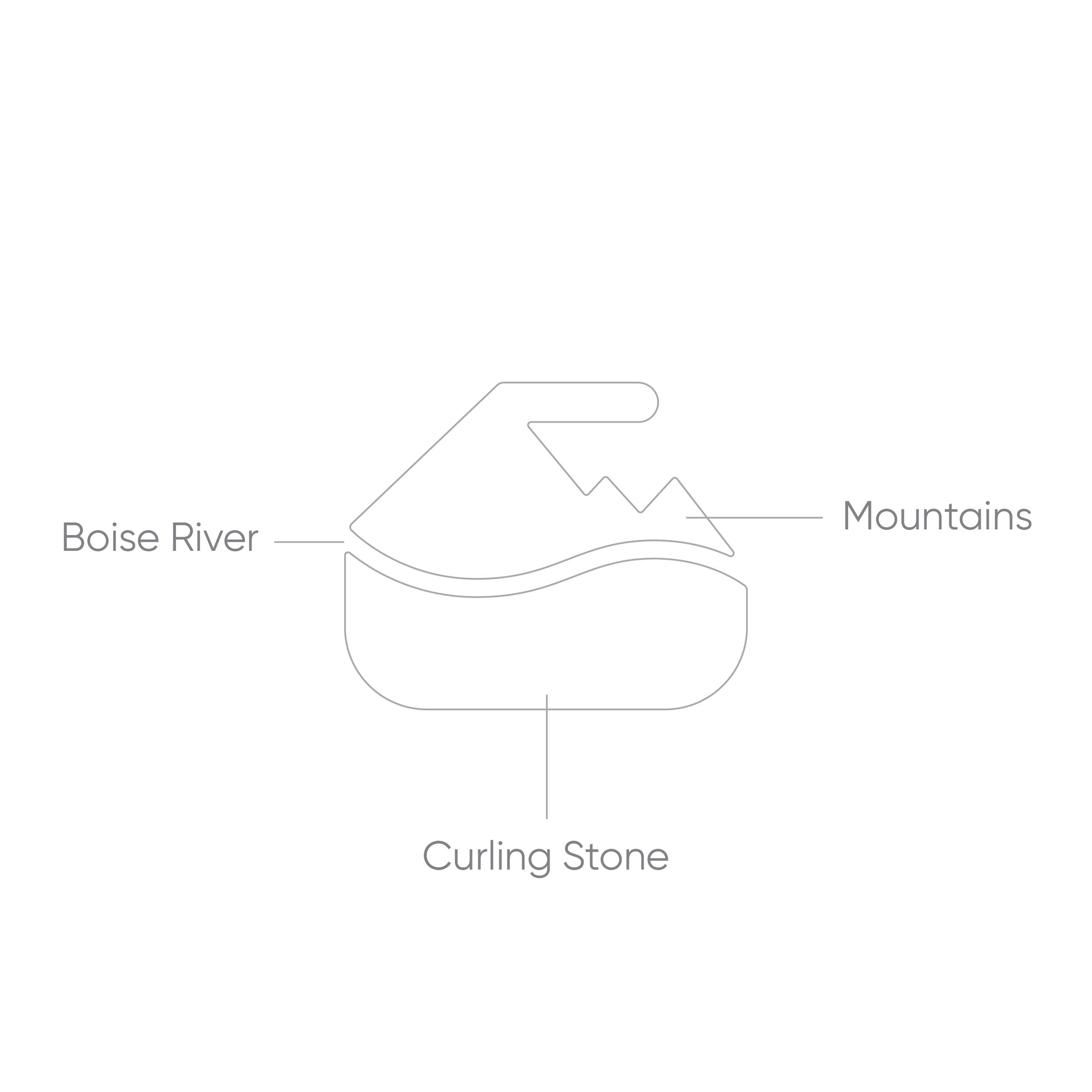
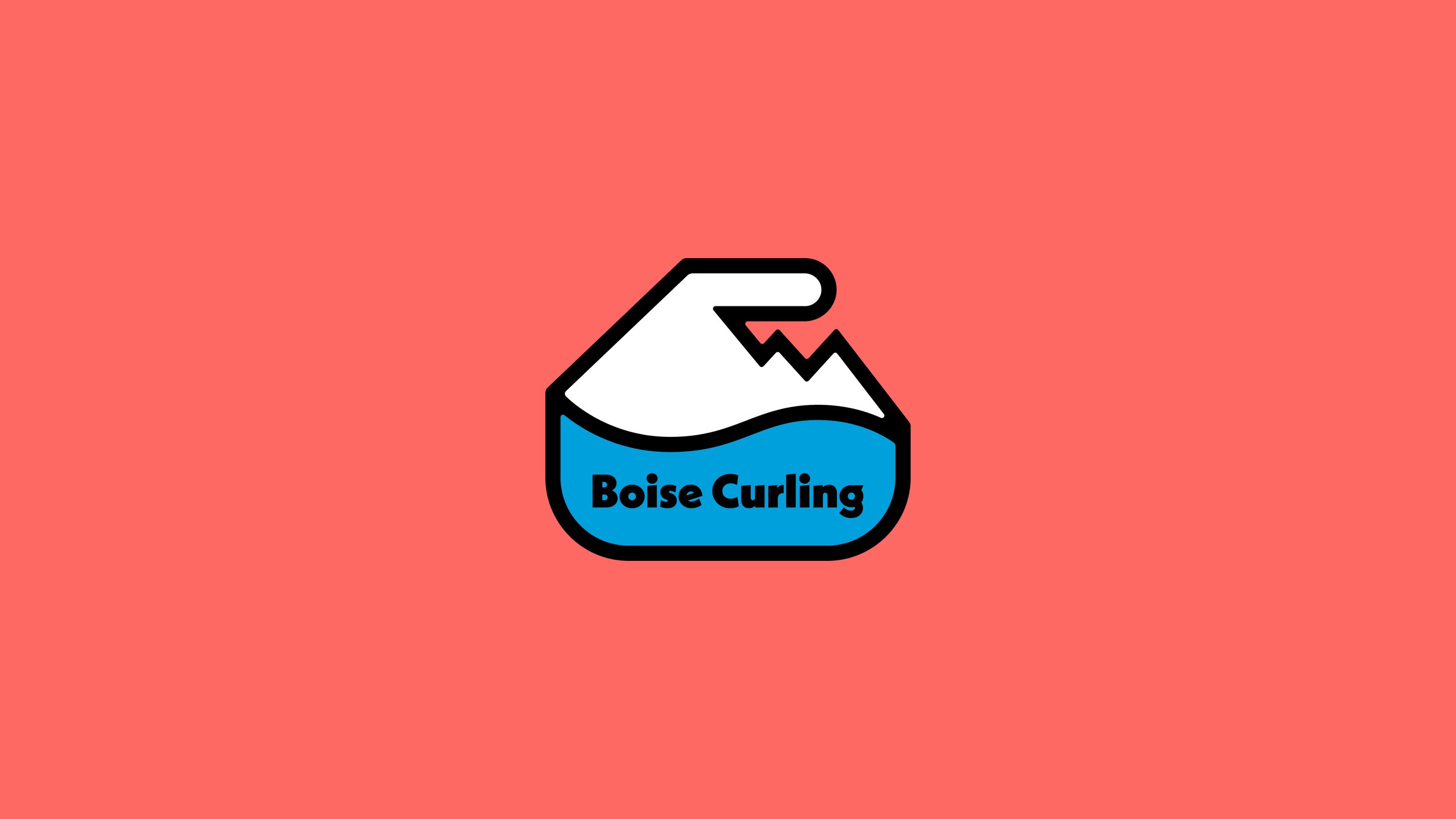
Inspired by the meandering Boise River and the majestic Idaho mountains, we created a curling stone brandmark that symbolizes the club’s deep-rooted connection to their surroundings.
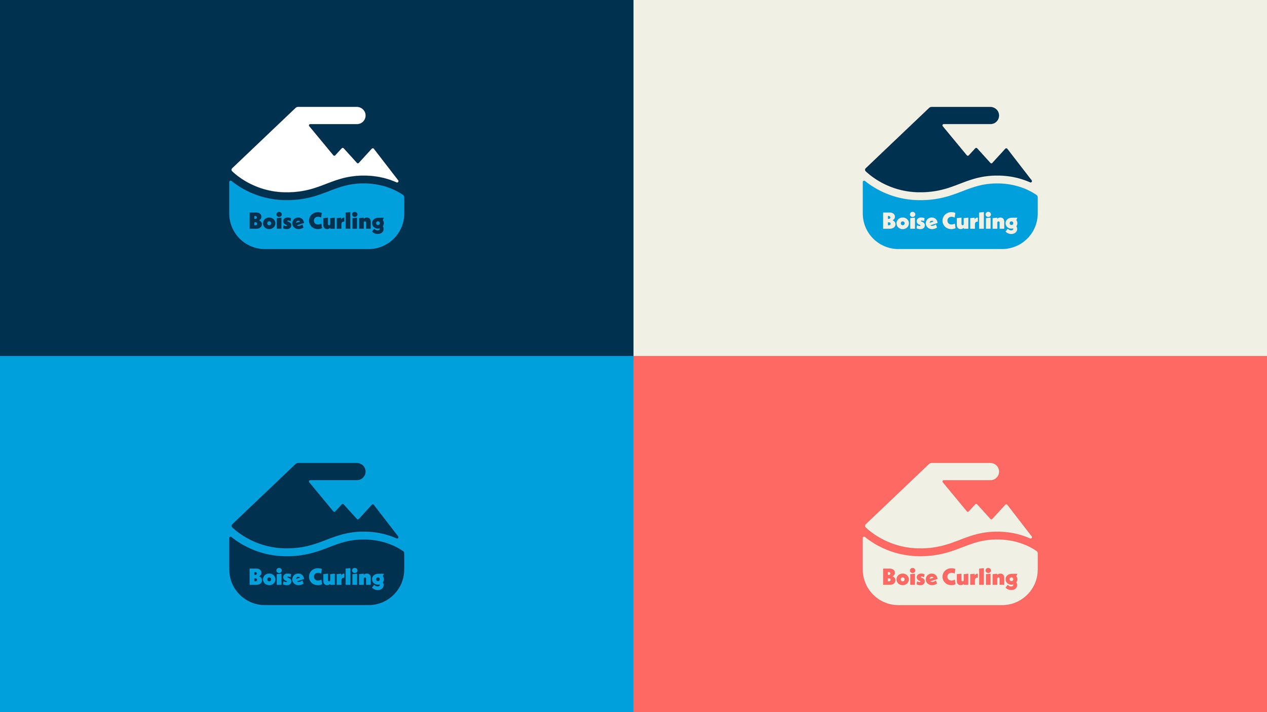
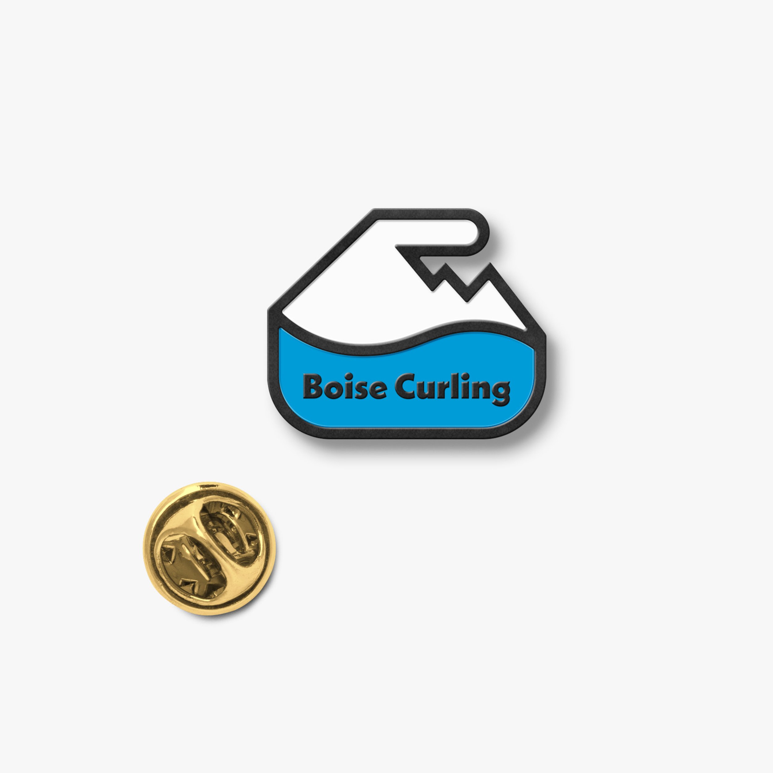
This iconic curling stone became the foundation of the full brand identity, elegantly scaling down for a tiny curling pin and scaling up for bonspiel uniforms.
A comprehensive brand kit set the stage for brand consistency as they began promoting the 2023-2024 season.

What we did for Boise Curling
Logo Design and Identity
Brand Guidelines
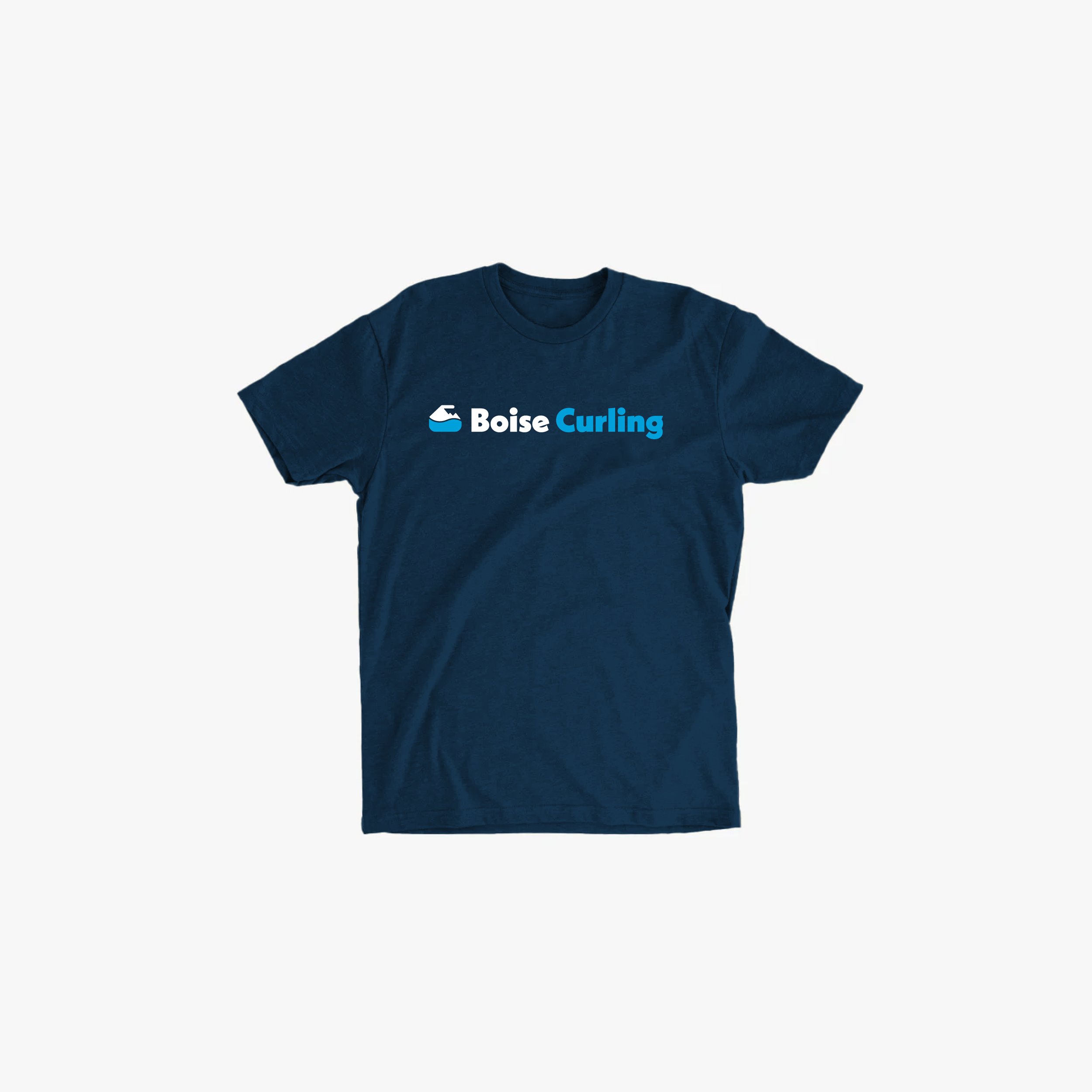
Apparel Design
Jersey Design
Curling Pin Design
Social Media Templates
Presentation Template
