Description
Broken String Tennis is a modern tennis apparel brand built for players who take the game seriously. Designed to feel less country club and more competitor, BST blends premium performance with a sharper, more focused point of view.


Logo Design
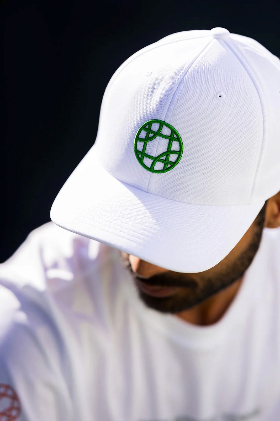
The BST brandmark transforms one of the most iconic moments in tennis, a broken string, into a bold, ownable symbol. The snapped strings create a hidden tennis ball at the center of the mark, turning frustration into identity. Simple, memorable, and unmistakably tennis, the mark embodies the competitive spirit behind the brand.


What clients are saying
“I can’t recommend Casey at Hodag Creative enough. He took the time to truly understand my vision and translated it into a cohesive brand—from the logo to the voice and graphic tees. His ability to take my ideas and turn it into an actual brand voice was done with incredible care and intention. The creativity, attention to detail, and ability to make everything feel unique to Broken String Tennis was outstanding. He is a true pro top to bottom.”
Jason Daniel, Founder
Broken String Tennis