Description
Boise Curling Club has built a strong reputation as one of the region's premier curling organizations, supported by a passionate community of athletes and volunteers. As membership grew and the limitations of a shared ice facility became more apparent, the club began laying the groundwork for a dedicated curling venue. The rebrand was created to support that vision, giving the organization an identity that reflected both its history and its future ambitions.

Identity Design
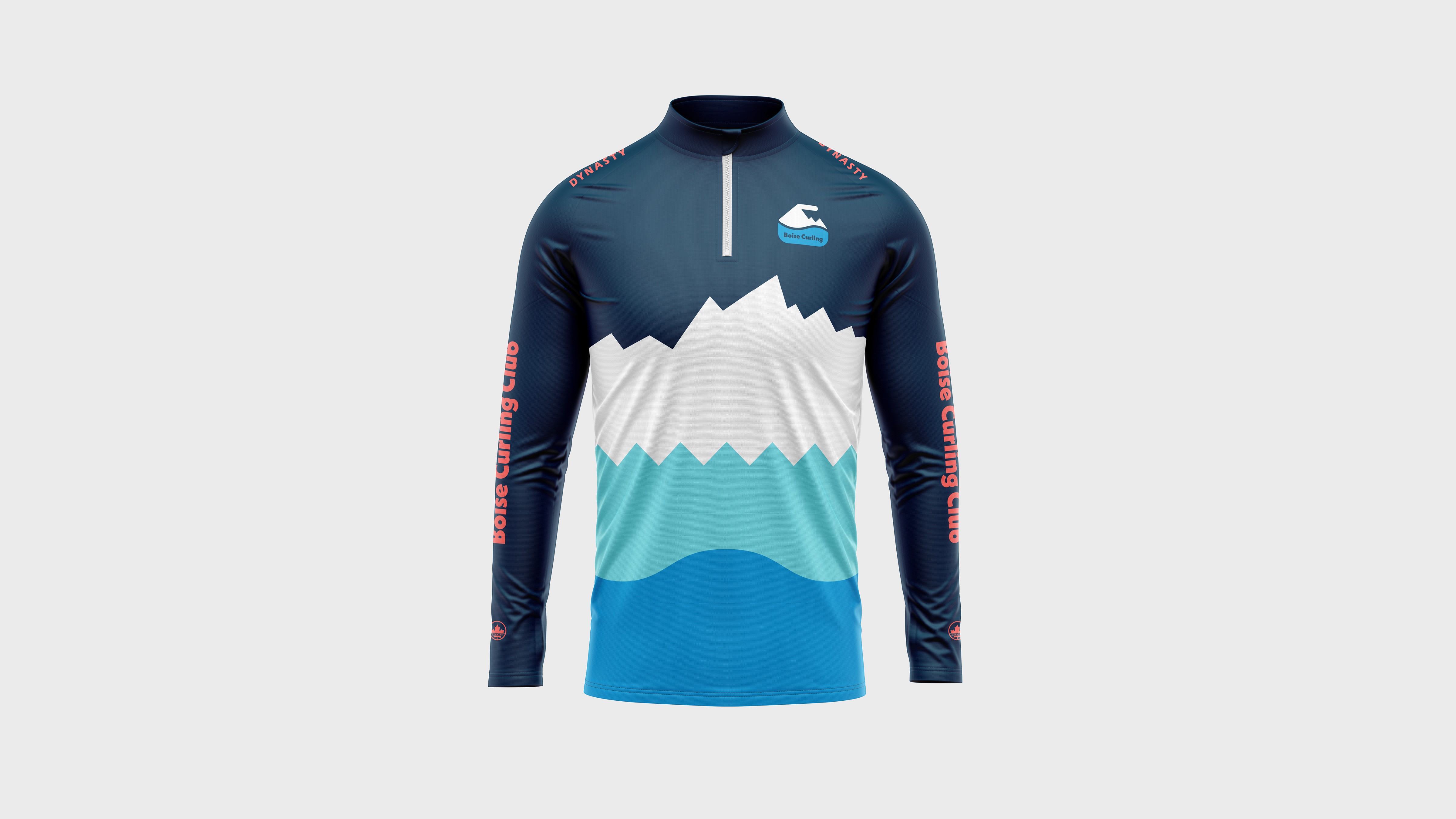
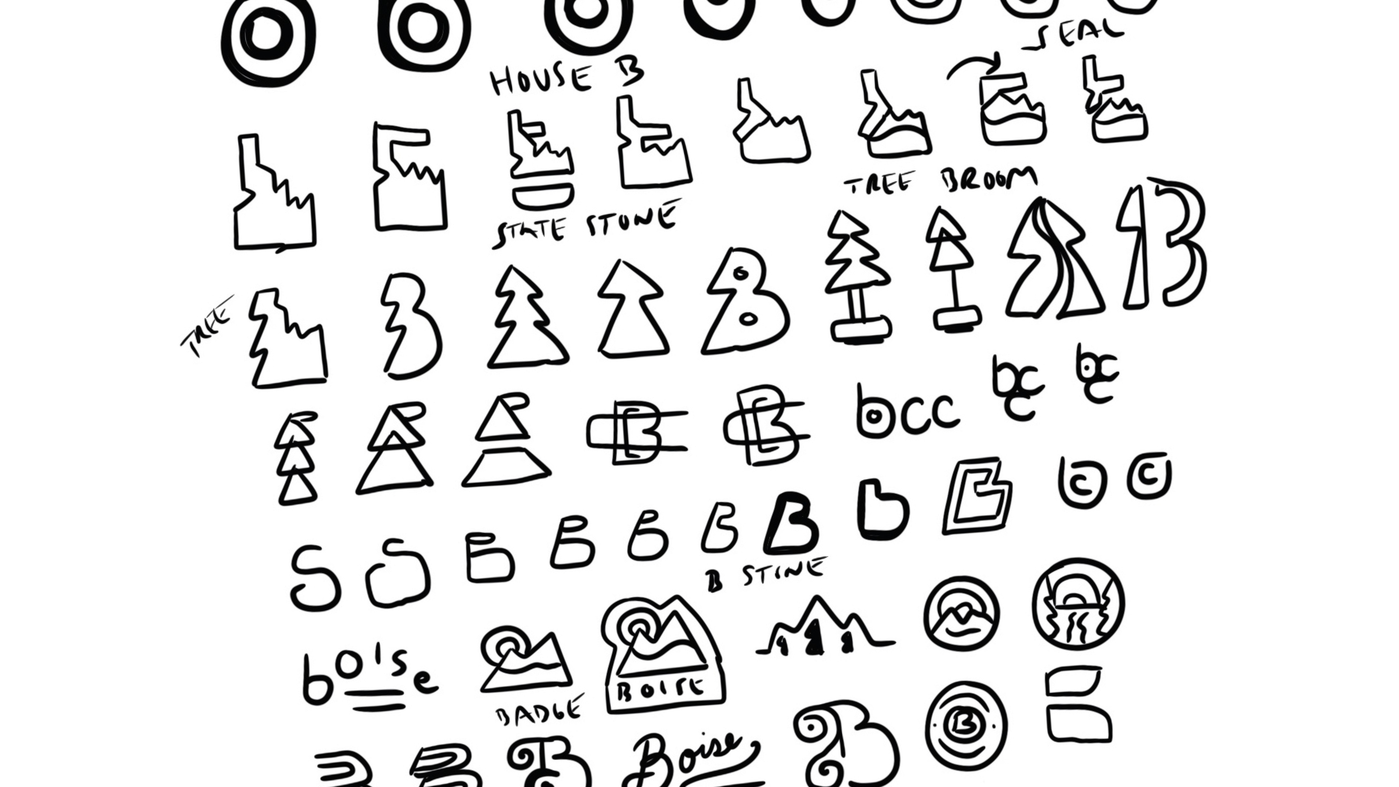
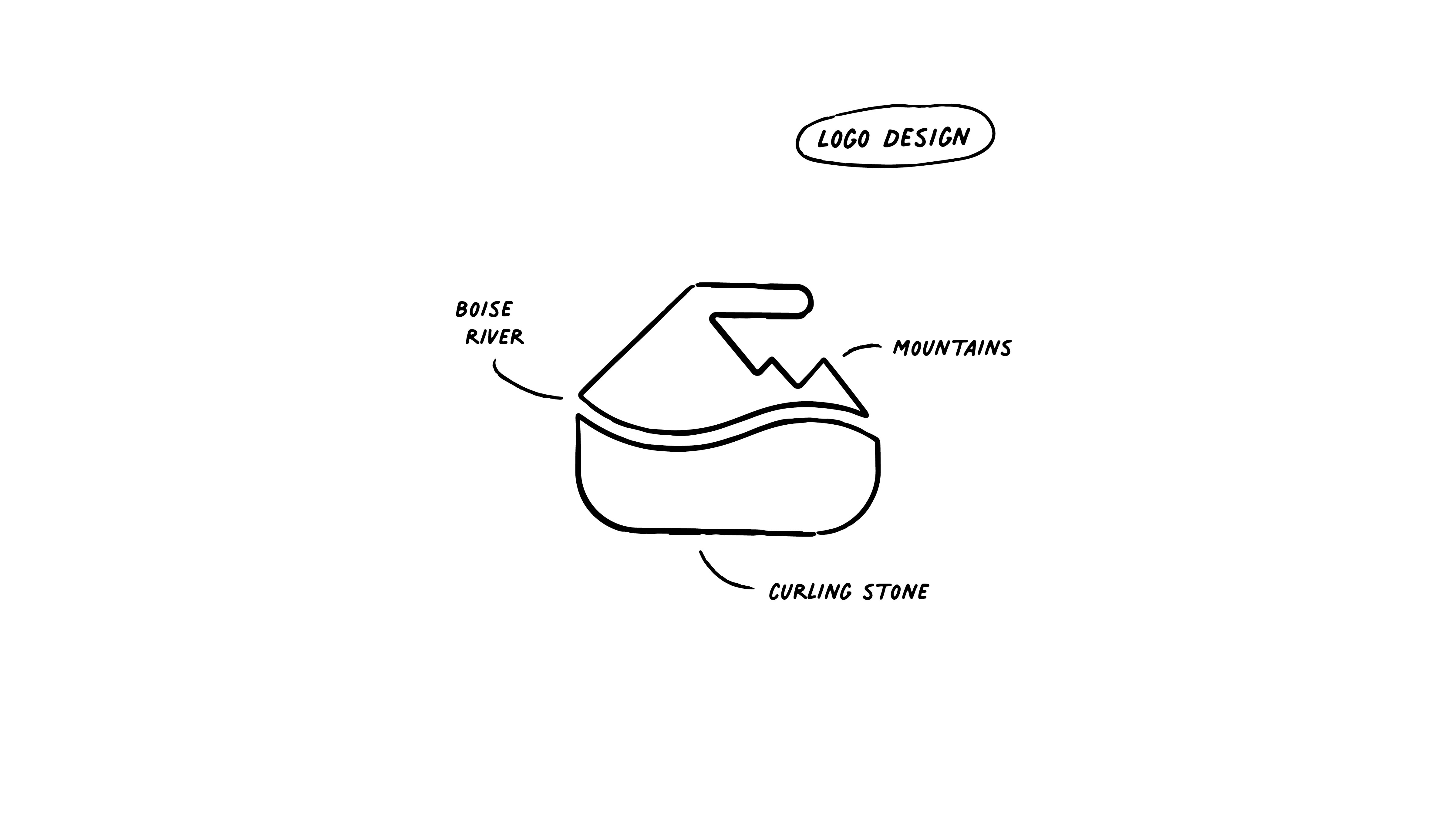
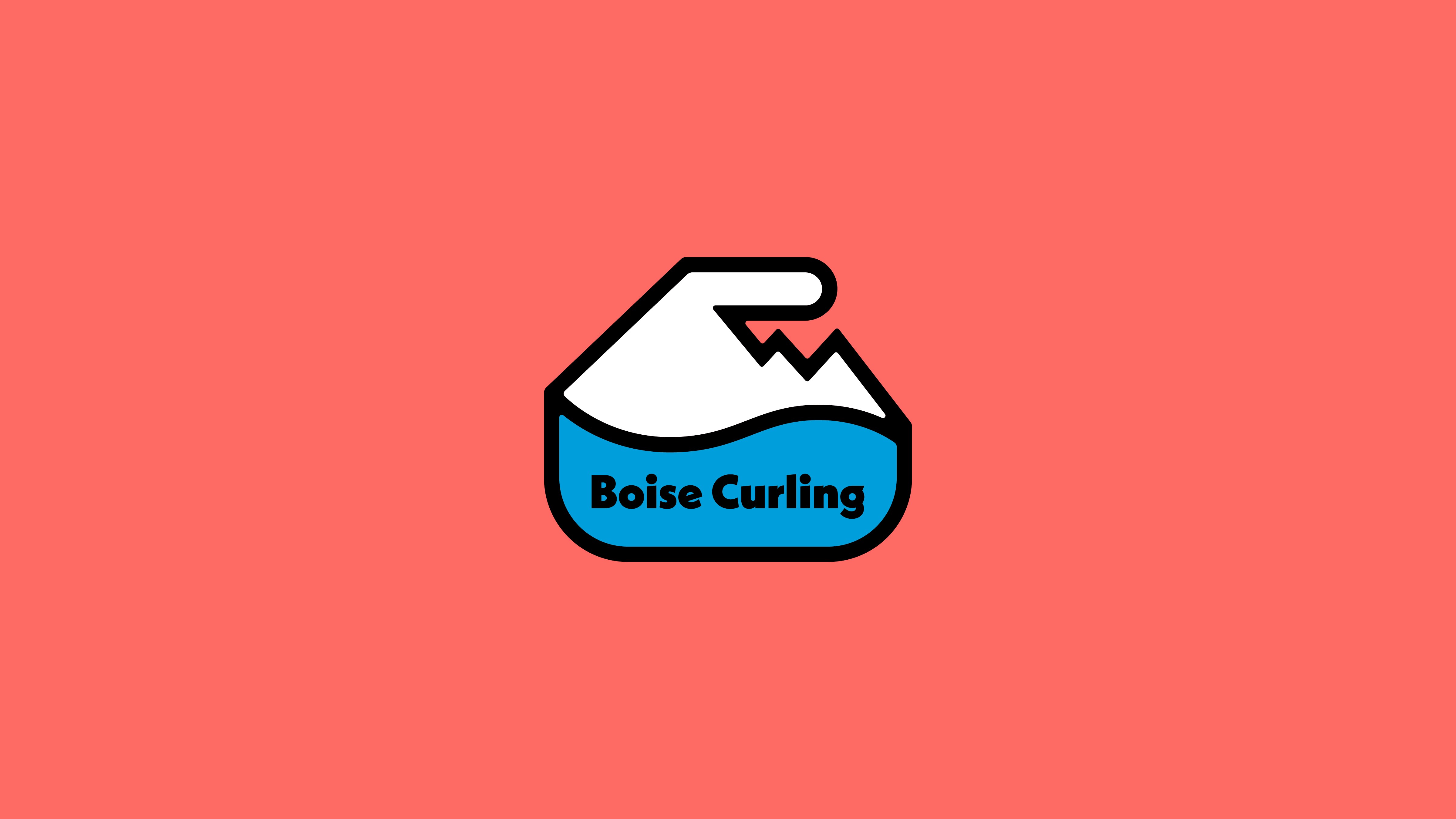
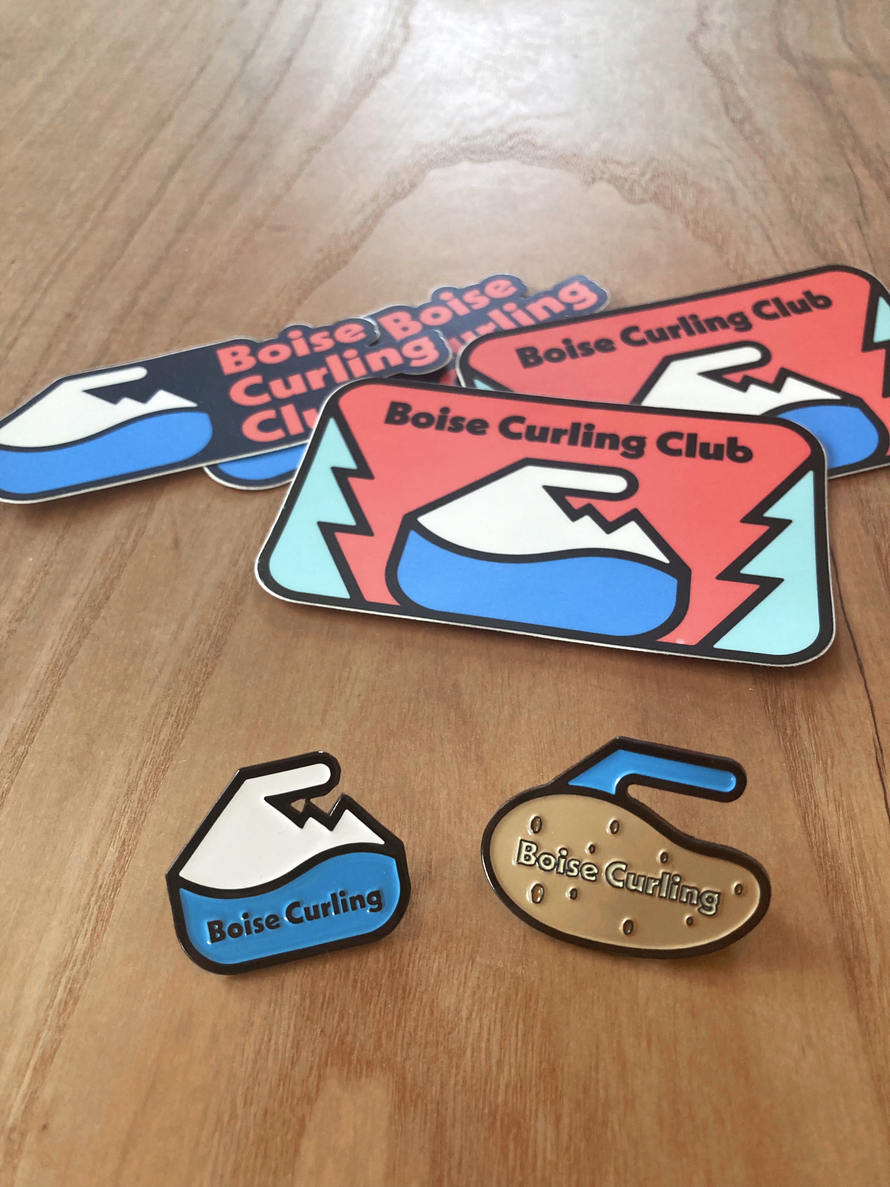
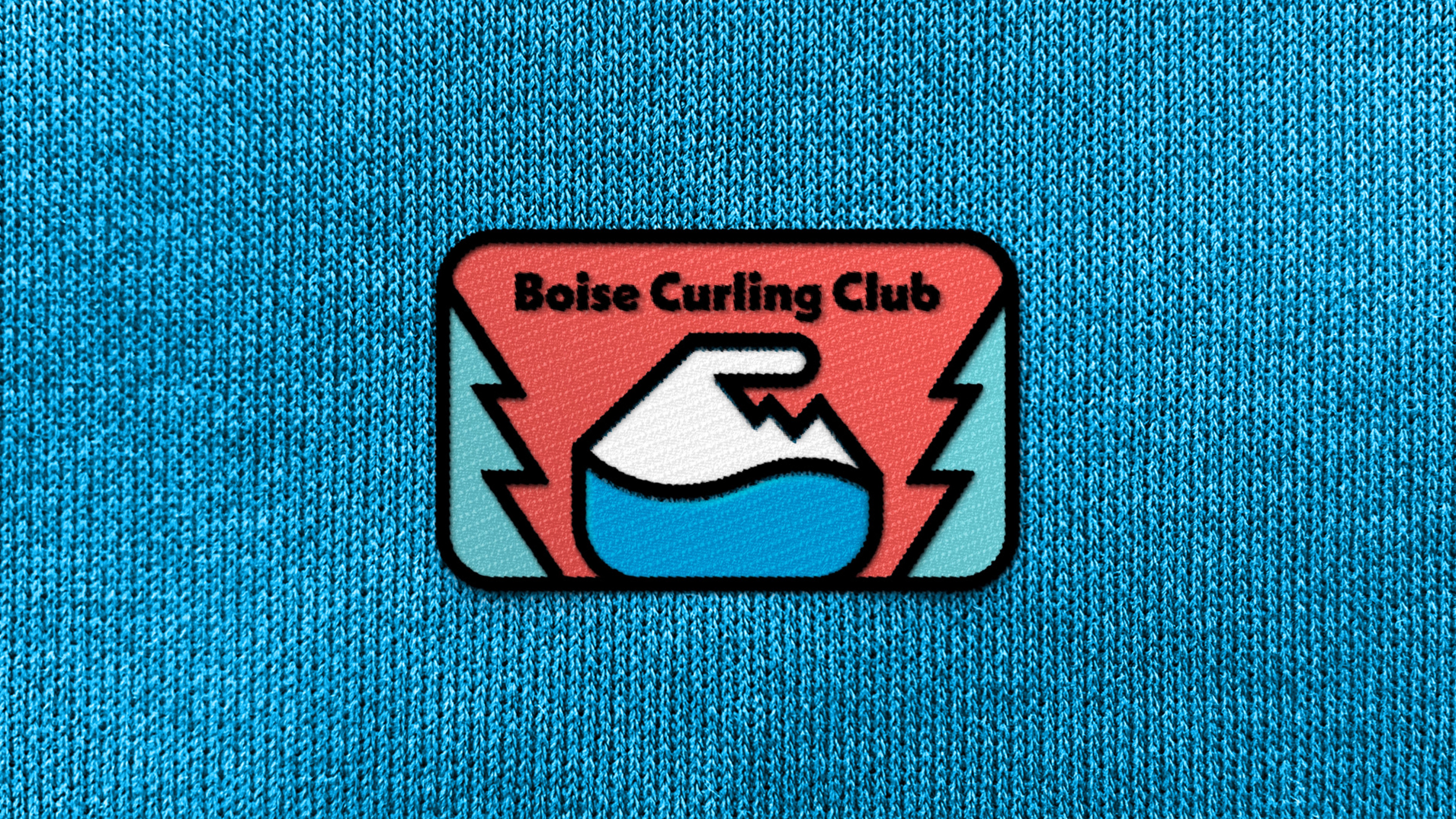
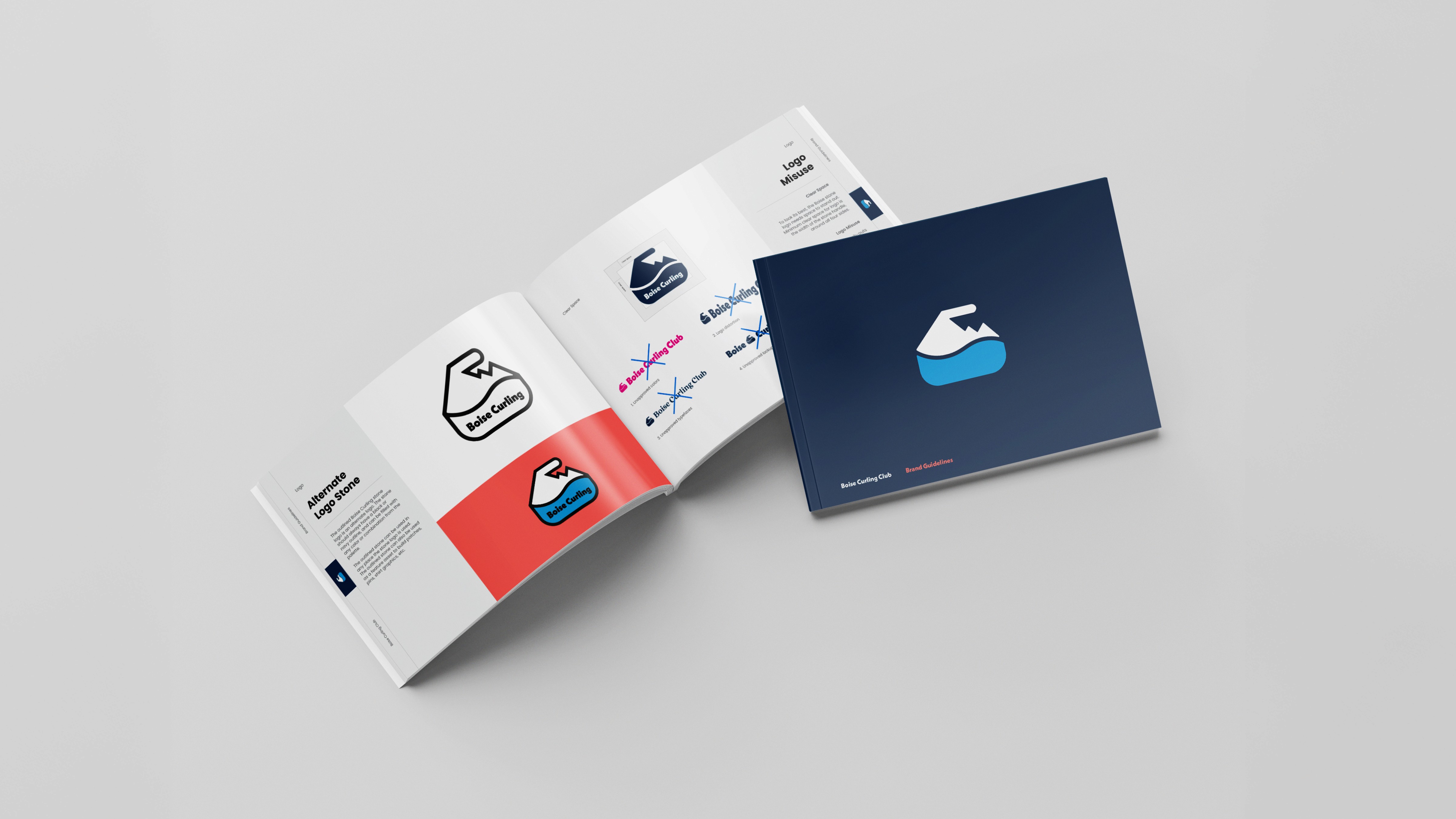
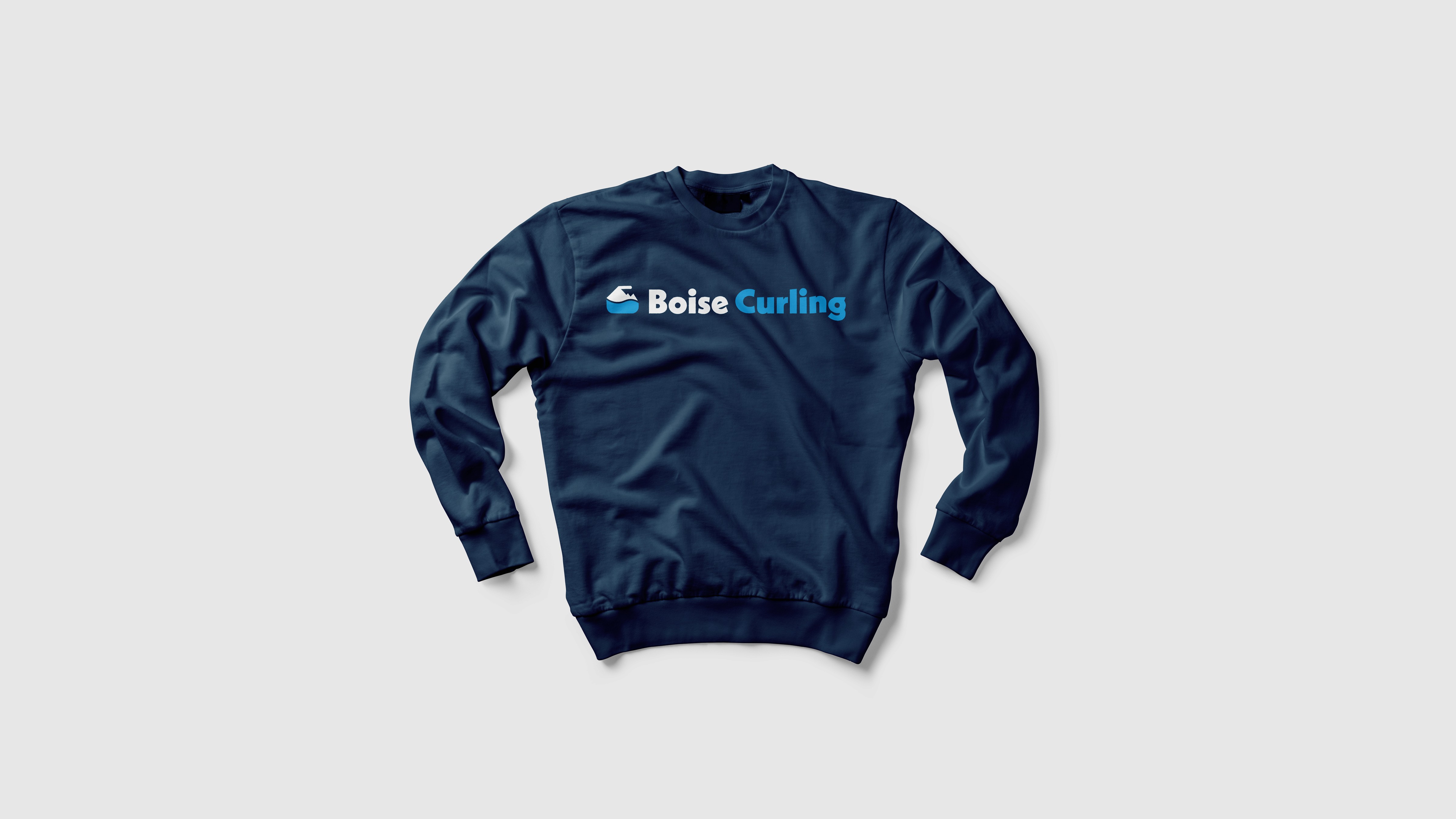
Inspired by the Boise River and the rugged Idaho landscape, the brandmark combines a curling stone, flowing river, and mountain silhouette into a single, distinctive symbol. The mark celebrates the club's connection to place while creating a strong foundation for the broader identity system. Whether stamped on a curling pin or featured across bonspiel uniforms, the design remains clear, recognizable, and unmistakably Boise.





What clients are saying
"We get so many compliments about our branding on the ice! People are obsessed with it and love our colors and design."
Heather Pritchard, President
Boise Curling Club